

What if your AI workflow node needs more than a simple text field or dropdown? What if you need a drag-and-drop shot sequencer, a timeline editor, or an interactive canvas? Standard parameter controls work for most cases, but when you're building specialized creative tools — video generation nodes, audio mixers, or complex configuration editors — you need the flexibility to craft purpose-built interfaces that match how users actually think about the problem.
Custom Widget Components give you that power. They're self-contained JavaScript UI components that integrate seamlessly into Foundry Griptape, providing rich, interactive experiences while maintaining the simplicity of parameter-based data flow. Whether you're building tools for video editors, sound designers, or data scientists, custom widgets let you create interfaces that feel native to the domain.
In this guide, we'll walk through how custom widgets work, show you a real-world example from the Kling AI video generation library, and share the patterns that make widgets both powerful and maintainable.
Why Custom Widgets?
Standard parameter controls such as text inputs, sliders, and dropdowns are the backbone of Griptape. They handle 95% of use cases elegantly. But certain workflows demand more sophisticated interaction patterns:
- Multishot video sequencing where each shot has its own prompt, duration, and can be reordered
- Audio timeline editing with waveform visualization and trim handles
- Color palette management with drag-to-reorder swatches
- Mask painting directly on preview images
- Graph editors for animation curves or decision trees
These aren't just nice to have features. They're the difference between a tool that technical users can grudgingly operate and one that creative professionals actually want to use.
The Three-Piece Architecture
A custom widget in Griptape involves three components working together:
1. The Widget JavaScript File
This is your UI component, a standalone JavaScript module that renders into a container and handles all user interaction. It receives the current value as a prop and calls an onChange callback when the user makes changes.
export default function MyWidget(container, props) {
  const { value, onChange, disabled } = props;

  const input = document.createElement('input');
  input.value = value || '';
  input.addEventListener('input', (e) => {
    onChange(e.target.value);
  });
  container.appendChild(input);
  return () => { /* cleanup */ };
}
2. The Node Python File
Your node references the widget via the Widget trait on a parameter. The parameter's value flows into the widget, and changes flow back out. Traits enable you to add different types of functionality to parameters. Widgets are one example, but you can also add sliders, dropdown options lists and more. You can learn more about traits in the Node Development Guide in our documentation.
from griptape_nodes.traits.widget import Widget

self.add_parameter(
	Parameter(
		name="config",
		type="dict",
		default_value={},
		allowed_modes={ParameterMode.PROPERTY},
		traits={Widget(name="MyWidget", library="My Library")},
	)
)
3. The Library Registration
Your griptape_nodes_library.json file registers the widget so the framework knows where to find it.
{
  "name": "My Library",
  "widgets": [{
    "name": "MyWidget",
    "path": "widgets/MyWidget.js"
  }]
}
The framework handles the rest; loading the widget code, instantiating it when the node renders, passing props, and routing value changes back to your node.
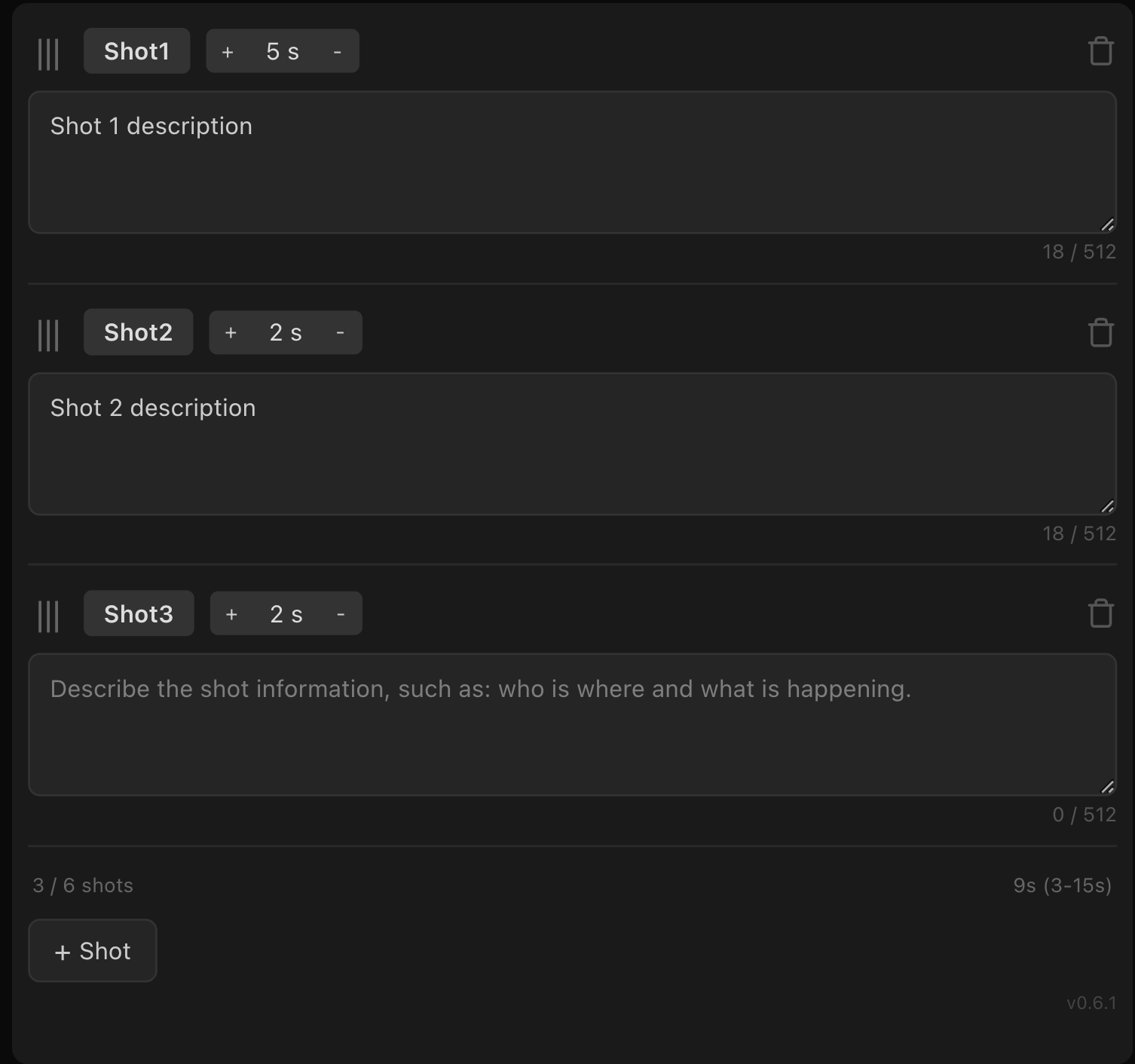
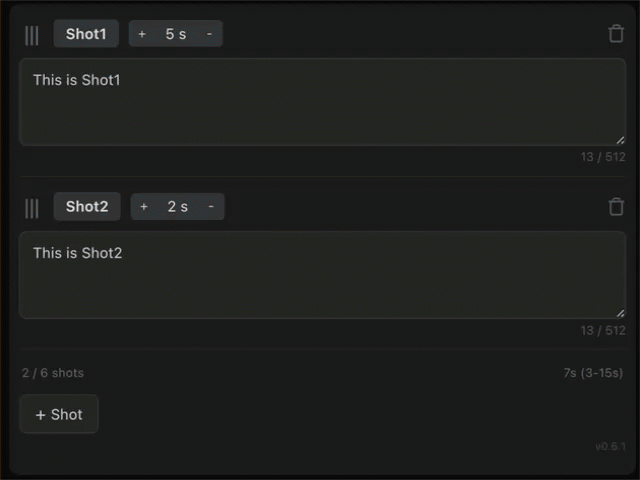
Real-World Example: Multi-Shot Video Editor
Using a production widget from the Griptape Kling AI library as an example, the KlingV3MultiShot node generates multishot video sequences where each shot has its own AI prompt and duration. Rather than forcing users to hand-edit JSON arrays, it provides a custom MultiShotEditor widget with drag-and-drop reordering, inline text editing, and constraint enforcement.
The Node Setup
Here's how the node declares the shots parameter:
DEFAULT_SHOTS = [{"name": "Shot1", "duration": 3, "description": ""}]

self.add_parameter(
	Parameter(
		name="shots",
		type="list",
		default_value=self.DEFAULT_SHOTS,
		traits={Widget(name="MultiShotEditor", library="Kling AI Library")},
	)
)
The parameter's value is a list of shot dictionaries. Users see a rich editor; the node sees clean structured data.
The Widget Structure
The MultiShotEditor widget manages complex state: shot names, durations, descriptions, drag-and-drop state, and validation constraints (3–15 seconds total, 1–6 shots, per-shot description limits). Here's how it handles the core data flow:
export default function MultiShotEditor(container, props) {
const { value, onChange, disabled } = props;
let shots = initializeShots(value);
function emitChange() {
onChange(shots.map((s) => ({ ...s })));
}
function render() {
// Build UI for each shot
}
render();
}Key Implementation Patterns
The MultiShotEditor demonstrates several critical patterns for building robust widgets:
1. Stable IDs for Reorderable Lists
When users drag shots to reorder them, array indices change but the underlying data needs to persist. Stable IDs solve this:
let nextShotId = 1;

function assignId(shot) {
  if (!shot.id) {
    shot.id = `shot-${nextShotId++}`;
  }
  return shot;
}

// Initialize with stable IDs
let shots = value.map((s) => assignId({ ...s }));
Display names (Shot1, Shot2) are renumbered on every render based on position, but the id field stays with the data through reorders and round-trips via onChange.
2. Emit on Blur, Update Locally on Input
Text inputs need to feel responsive but can't trigger full re-renders on every keystroke. The solution: update local state immediately, emit to the framework only when the user leaves the field.
textarea.addEventListener("input", (e) => {
  shots[index].description = e.target.value;
  // Update character counter UI immediately
});

textarea.addEventListener("blur", () => {
  shots[index].description = textarea.value;
  emitChange(); // Now tell the framework
});
Discrete controls like stepper buttons can emit immediately because they don't involve continuous user input.
3. Prevent Canvas-Level Event Interference
The canvas listens for drag events (for panning) and keyboard shortcuts (Delete to remove nodes). Your widget needs to stop these events from bubbling up:
// Prevent node drag and keyboard shortcuts
const wrapper = el("div", {
className: "multi-shot-container nodrag nowheel"
});
textarea.addEventListener("keydown", (e) => e.stopPropagation());
textarea.addEventListener("pointerdown", (e) => e.stopPropagation());Without this, pressing Delete while editing a shot description would delete the entire node.
4. Visual Feedback for Drag-and-Drop
The widget implements drag-and-drop reordering with a floating clone and drop indicators:
function onDragStart(e, index) {
  const itemEl = e.target.closest(".shot-item");

  // Create floating clone for visual feedback
  dragClone = itemEl.cloneNode(true);
  dragClone.style.position = "fixed";
  dragClone.style.opacity = "0.85";
  document.body.appendChild(dragClone);

  itemEl.style.opacity = "0.3"; // Dim original
}
The blue drop indicator updates on pointermove, and the actual data reorder happens only on pointerup after the user commits.
Building Your First Widget
Here’s how to create a simple color palette editor widget like this one:
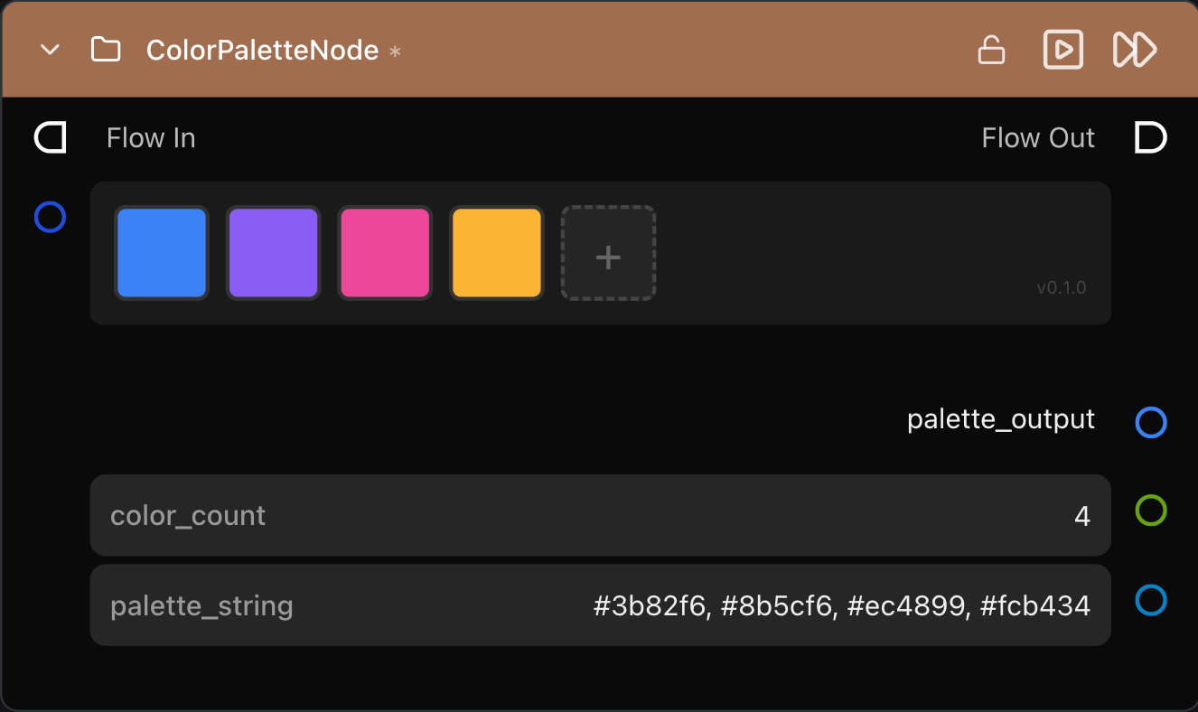
In this example node the custom color display and selection widget displays the list of color strings as color swatches and enables a user to modify them using a color picker component. You can see in the list of strings that the widget represents in the palette_string parameter at the bottom of the node.
1. Create the Widget File
Start with the widget signature and basic rendering:
export default function ColorPaletteEditor(container, props) {
const { value, onChange, disabled } = props;
let colors = value || ["#3b82f6", "#8b5cf6", "#ec4899"];
function render() {
container.innerHTML = "";
colors.forEach((color, i) => {
container.appendChild(buildSwatch(color, i));
});
}
render();
}Build interactive color swatches:
  function buildSwatch(color, index) {
    const swatch = document.createElement("div");
    swatch.style.background = color;
    swatch.addEventListener("pointerdown", (e) => {
      e.stopPropagation();
      const picker = document.createElement("input");
      picker.type = "color";
      picker.value = color;
      picker.onchange = () => { colors[index] = picker.value; emitChange();
  render(); };
      picker.click();
    });
    return swatch;
  }
2. Register in Library JSON
{
  "name": "Color Palette Editor Library",
  "widgets": [{
    "name": "ColorPaletteEditor",
    "path": "widgets/ColorPaletteEditor.js"
  }]
}
3. Use in Your Node
self.add_parameter(
	Parameter(
		name="palette",
		type="list",
		default_value=["#3b82f6", "#8b5cf6", "#ec4899"],
		traits={Widget(
			name="ColorPaletteEditor",
			library="Color Palette Editor Library"
		)},
	)
)
Note that the definition of the Widget refers back to the library name and widget name that are defined in the Library JSON file.
Widget Development Best Practices
Performance Considerations
- Minimize re-renders: Cache DOM references when possible. Don't rebuild the entire UI on every value change if you can update specific elements instead.
- Debounce expensive operations: If your widget does complex calculations (layout, image processing), debounce them so they don't run on every pixel of a drag operation.
- Clean up properly: Remove document-level event listeners, cancel timers, and clean up any resources in your cleanup function.
Accessibility
- Keyboard navigation: Support tab navigation through interactive elements.
- ARIA labels: Add `aria-label` attributes to icon-only buttons.
- Focus management: When showing modal dialogs or inline editors, manage focus appropriately.
Validation and Constraints
- Disable, don't hide: When an action isn't available (e.g., 'add' when at max items), disable the button rather than hiding it. Show why through visual feedback (status bars, tooltips).
- Validate on blur: Run validation when users leave a field, not on every keystroke.
- Surface constraints early: Show character counts, budget remaining, or items used vs. max so users understand limits before hitting them.
State Management
- Always clone on emit: Never pass your internal state object directly to
onChange. Clone it first. Cloning prevents the widget and framework from sharing the same object reference, which would break change detection and cause unpredictable behavior when the widget modifies its internal state. - Preserve unknown fields: If your widget only edits specific fields of a complex object, preserve fields you don't understand when emitting changes.
- Handle invalid input gracefully: If `props.value` is malformed, fall back to sensible defaults rather than crashing.
Common Widget Patterns
List Editors with Add/Remove
See the MultiShotEditor example with stable IDs, aggregate constraints, inline editing.
Color Pickers
The native <input type="color"> picker works well, but for advanced needs (palettes, swatches, eyedropper), consider integrating a library like Coloris or iro.js. This is very simple to do with an AI coding tool such as Claude Code or Cursor.
Drag-and-Drop File Zones
Handle dragover, dragleave, drop events. Prevent default to stop the browser from opening the file. Read files with FileReader.
Timeline/Range Editors
Use dual-handle range sliders, constrain min/max, show current values, allow keyboard input for precise values.
Canvas-Based Editors
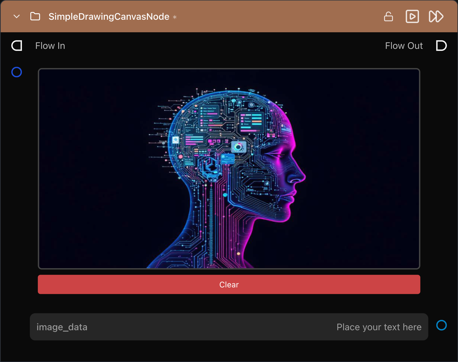
For mask painting, curve editing, or custom graphics, use <canvas>. Remember to scale for retina displays (devicePixelRatio) and clean up animation frames. You can find an example of a node with a canvas widget in the Griptape Nodes Library Template repo. This node, shown below, enables you to drawn annotations on an existing image and output the merged composite image.
When to Use Custom Widgets
Custom widgets add complexity, meaning more code, more surface area for bugs, more maintenance burden. Use them when:
- The standard controls genuinely can't express the interaction. If you can hack it together with sliders and text fields, do that first.
- The widget will be used frequently. A complex widget for a rarely-used node is questionable ROI.
- The domain demands it. Video editors expect timeline interfaces. Audio engineers expect waveforms. Don't fight users' mental models.
Next Steps
You're now equipped to build custom widgets for Griptape. Start simple. Try a small list editor or color pickerbefore tackling drag-and-drop timelines or canvas-based painters.
Resources:
- Comprehensive Developer Guide - Custom Widget Components
- Kling AI Library Source Code - Real-world widget examples
- Foundry Griptape Documentation
- Community Discord - Ask questions, share widgets, get feedback
Custom widgets transform Griptape from a powerful workflow engine into a platform for building the creative AI tools your team actually wants to use.